

En Forma Gym is an app for gyms, which provides different features and services. Helping the users to reserve the training class based on their levels, needs, and goals. This app has also the goal of improving the services and experience that the gyms are providing to their customer. Increasing company’s the value proposition
For this project, we decided to use a goal-directed design method which revolves around focusing on our persona creation and goals.
Key challenge:
- The customers of the gym, don’t have an app to reserve a training class as well as a
training report. - Users do not have enough information about the training classes. So they don’t know what to expect from the classes.
- Most of the time, users must pay on-site, and They’d like to pay online.
- The user cannot track their progress in the gym, therefore they do not know if they are improving or leading to their target/goal.
Solution:
The website provides information regarding the entire membership process;
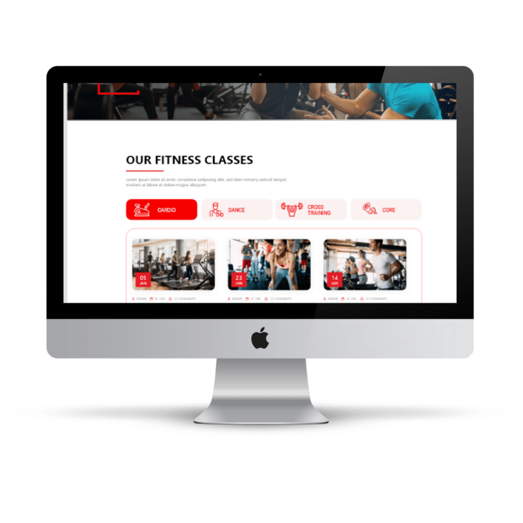
- Training information, for whom this training is intended, and some extra information such videos, and reviews.
- Equipment of each room (videos, photos, and available activities).
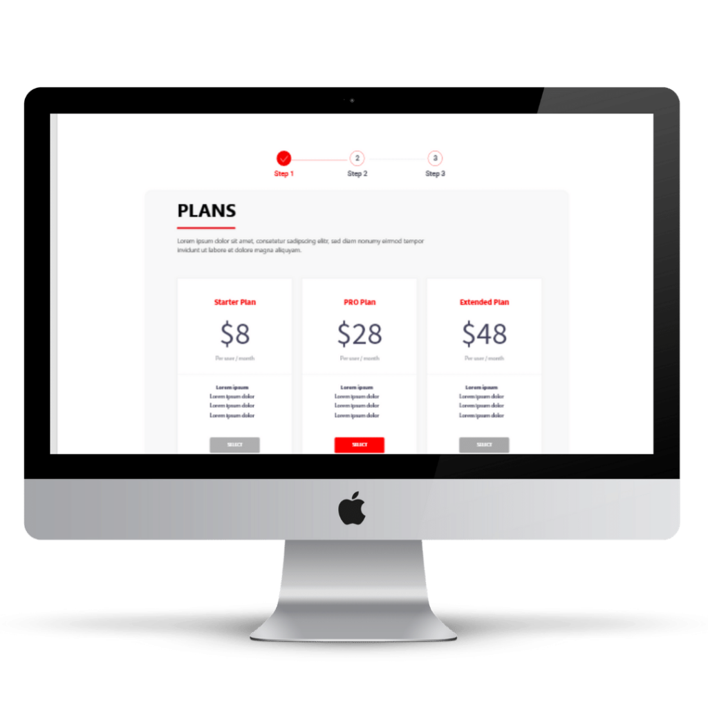
- Types of members. We have chosen to create different types of members, depending on their needs and situation.
- Enrolment process. Many people are not familiar with the enrollment process, especially when it is online, as they tend to have a lot of questions, but with our assistant who accompanies and guides them through the entire enrollment process, they will be able to complete their enrollment without having to think too much.
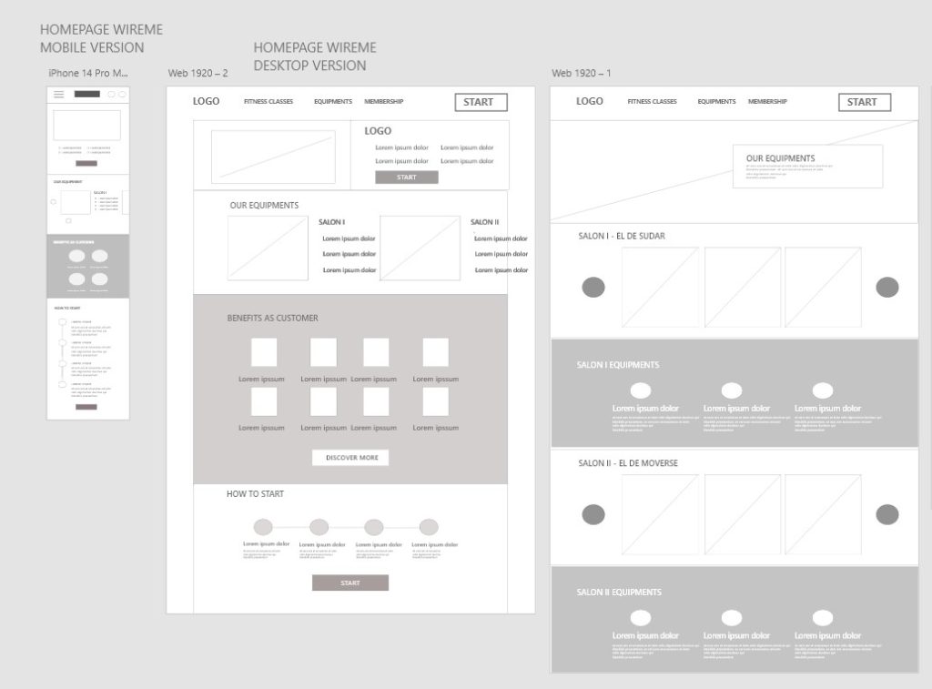
Sketches and prototypes:
User testing result:
I created a prototype from low-fidelity wireframes and prepared a 11-questions survey for participants to fill out before conducting a usability test. I asked 16 different participants to run through different scenarios in my prototype in hopes of garnering enough feedback to use for my next set of design iterations.
Usability study:
Finding:
- The users missed a summary with all the classes on the equipment page.
- The cancelation policy wasn’t clear
- Not enough payment options.
- The users miss a breadcrumb to know in what part of the suscription are.
- No clear differentiation between the different plans that exist.
Accessibility considerations:
- Before we had many windows and the process was a bit longer, and the user was lost through the process.
- Provided universally recognized icons to help make navigation easier to understand, as well as
change the colors and components’ design. - We have included more information regarding the subscription process, as well as information and transparency.
Mockups:
After the usability study, we had to make all the modifications to meet user’s needs.
Here mockups that we created.
More than a subscription, it is an opportunity to know your potential.
On this website we wanted to show users that we are not just a gym, we help you to have all the information about your progress and know your potential.
- Information about all classes and their dates.
- The equipment of each room.
An easy and transparent purchasing process.
With a clean and professional style checkout process we want to make the subscription process easy to navigate.
Do you want to see the whole mockup?
Okay, check this mockup out in Adobe XD.
Conclusion:
After carrying out a study of our users, prioritizing their needs, as well as what they think of the usability of the website, we believe that we have developed a website according to their needs.